Introduction
Every organization collects survey data. Customer satisfaction scores, employee engagement metrics, market research responses, NPS benchmarks — the data piles up month after month. But for most organizations in the Gulf region, this data sits in spreadsheets and static reports, seen by a handful of analysts and forgotten by everyone else. The result? Surveys that cost tens of thousands of dirhams to run generate insights that never reach the people who could actually act on them.
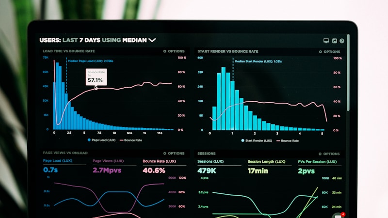
Interactive dashboards change this equation entirely. They transform static survey data into living, breathing visual stories that update in real time, can be filtered by department or segment, and are accessible to every decision-maker in the organization — not just the analytics team. Here's how to build dashboards that turn survey data into strategic advantage.
Why Dashboards Beat Spreadsheets Every Time
A spreadsheet containing 5,000 survey responses is a data storage tool. A dashboard visualizing those same 5,000 responses is a decision acceleration tool. The difference is not the data — it's the speed at which the human brain can extract meaning. Research shows that the brain processes visual information 60,000 times faster than text. When your customer satisfaction score drops 8 points in the Dubai market, a dashboard shows you instantly with a red trend line. A spreadsheet requires someone to notice, filter, calculate, and report — typically days later.
For GCC organizations specifically, dashboards solve a unique challenge: distributed decision-making across multiple branches, emirates, or countries. A retail chain with stores in Dubai, Abu Dhabi, and Riyadh can give each store manager a dashboard filtered to their location — empowering local action while maintaining central visibility. Without dashboards, local data gets lost in aggregated reports.
Step 1: Define Your Dashboard Audience and Purpose
The biggest mistake in dashboard creation is trying to build one dashboard for everyone. The CEO needs high-level trends and exceptions. Department heads need segment-level comparisons and drill-down capability. Frontline managers need specific, actionable metrics for their team or location. Build separate dashboards — or at minimum, separate views — for each audience. A dashboard that tries to serve everyone serves no one.
Define 3-5 key questions each audience needs to answer. For a customer experience director: 'Which branches have the lowest NPS this quarter? Which service touchpoints cause the most dissatisfaction? How has satisfaction trended since our last policy change?' Your dashboard should answer these questions at a glance — without requiring the user to click, filter, or calculate.
Step 2: Choose the Right Visualizations
Not all survey data belongs in the same chart type. Likert scale responses (agree/disagree) work best as stacked bar charts or heatmaps. NPS trends over time are clearest as line charts with benchmarks. Demographic breakdowns are most intuitive as horizontal bar charts sorted by value. Open-ended text responses — increasingly important — benefit from word clouds and sentiment analysis summaries. One critical rule: never use pie charts for more than 5 categories, and never use them for survey data where respondents could select multiple options.
Step 3: Automate Data Flow
A dashboard that requires manual data uploads will be outdated within days and abandoned within months. The entire value proposition of dashboards over static reports hinges on real-time or near-real-time data. Connect your survey platform directly to your dashboard tool. When a customer completes a satisfaction survey in Riyadh, that response should flow into the dashboard within minutes — not days. Surview's platform integrates directly with leading dashboard tools, enabling live data pipelines that require zero manual intervention.
Step 4: Add Context and Benchmarks
A number without context is meaningless. An NPS score of 42 tells you nothing until you know: Is that up or down from last quarter? How does it compare to the industry average? How does it vary by customer segment? Every key metric on your dashboard should include a trend indicator (up/down arrow with percentage change), a benchmark comparison (vs. target, vs. last period, vs. industry), and the ability to filter by relevant segments. Without context, dashboards become decoration.
Step 5: Build for Mobile
GCC executives spend significant time traveling between branches, cities, and countries. If your dashboard only works on a desktop monitor, it will be ignored during the moments when decisions actually get made — in airport lounges, between meetings, or on-site at a branch visit. Optimize your most critical dashboard views for mobile. Prioritize the 3-5 metrics that matter most for on-the-go decision-making. At Surview, our dashboard platform generates mobile-responsive views automatically, ensuring leaders have data when and where they need it.
Common Mistakes to Avoid
Overloading: 50 charts on one dashboard is not comprehensive — it's overwhelming. Limit to 8-12 visualizations per view. Ignoring statistical significance: showing percentage differences between segments without noting sample sizes leads to false conclusions. Always display or note n-values. Beauty over function: 3D charts, excessive animation, and complex visualizations reduce comprehension speed. Prioritize clarity over aesthetics. No action links: a dashboard that shows a problem without linking to the solution (e.g., drilling down to individual responses) creates frustration rather than empowerment.
Conclusion
Dashboards transform survey data from something that gets filed into something that gets used — daily, by everyone from the CEO to frontline managers. The five steps outlined here — defining audience, choosing visualizations, automating data flow, adding context, and building for mobile — provide a practical framework that any organization can apply, regardless of technical maturity.
Surview's Dashboard Creation service turns your survey data into stunning, interactive dashboards in minutes — no coding, no manual data wrangling, no waiting for IT. Built for the unique needs of GCC organizations, with Arabic/English bilingual support and mobile-optimized views. Ready to see your data differently? Book a demo today.